The close is late again. Your CEO wants a current view of cash, margins, and performance by location, but the Controller has to reconcile spreadsheets before anyone trusts the answer. In a multi-entity organization, the problem gets worse. Different teams use different definitions, reporting dimensions drift, and an executive dashboard becomes a polished summary of numbers nobody can trace.
The strongest financial dashboard examples aren't attractive screens alone. They connect clearly defined KPIs to consistent dimensions, transaction-level drill-downs, entity controls, and an auditable source of truth. This list evaluates seven real dashboard galleries and templates by the finance problem they address, the KPI structure they demonstrate, the implementation burden they create, and the decision value they can deliver.
Lucentive uses this same standard with Sage Intacct dashboards and reporting. As a Sage Intacct Value Added Reseller and Premier Implementation Partner, Lucentive brings healthcare, nonprofit, and mid-market experience to the work. The objective isn't to buy software and hope useful reporting appears. It's to implement the right financial structure, roles, dimensions, workflows, and drill-down paths so leaders can use the numbers with confidence.
Table of Contents
- 1. Sage Intacct Dashboards and Reporting for Finance Teams
- 2. Tableau CFO Dashboards Gallery
- 3. Microsoft Power BI Data Stories Gallery for Finance
- 4. Qlik Financial Dashboard Examples
- 5. Databox Financial Dashboard Templates
- 6. Geckoboard Finance and CFO Dashboard Examples
- 7. Domo Finance Dashboard Examples
- Top 7 Financial Dashboard Comparison
- Turn Dashboard Inspiration Into Finance Control
- Summary
- FAQ
1. Sage Intacct Dashboards and Reporting for Finance Teams
A finance dashboard built directly on Sage Intacct starts with the operating model, not the visual design. Lucentive's Sage Intacct dashboards and reporting service is designed for CEOs, CFOs, Controllers, and operational owners who need consistent financial and operational visibility without maintaining a parallel spreadsheet reporting system.
The practical advantage is role separation. An executive view can focus on revenue, expenses, cash flow, profitability, and performance trends. A Controller view can emphasize close status, account balances, reconciliations, budget variance, and audit support. An operational owner may need location, department, program, service-line, or project performance. Those users shouldn't all receive the same crowded canvas.
What the implementation needs to solve
The valuable work happens beneath the KPI tiles. Lucentive can help define report groups, dimensions, navigation, and drill-down behavior so a user can move from a summary result into the report and transaction detail behind it. That matters when a CFO asks why margin changed, a nonprofit leader needs to understand grant spending, or a healthcare operator wants to compare locations.
A dashboard architecture should clarify:
- Metric definitions: Revenue, margin, cash, and variance must mean the same thing across roles.
- Dimensions: Entity, department, location, program, grant, project, and service line need consistent use.
- Drill-down paths: Users should move from a KPI to supporting reports and transactions without asking Finance to rebuild the analysis.
- Security: A location manager shouldn't automatically see every entity or fund.
- Workflow alignment: Reporting should reflect the close process instead of exposing unfinished or inconsistent data.
Practical rule: A dashboard can't repair an inconsistent chart of accounts, weak dimension design, or an undefined close policy.
The trade-off is clear. This approach applies to organizations using Sage Intacct, and it requires implementation effort and likely customization. It isn't a standalone visualization layer that sits casually on top of any accounting system. The return is a more controlled foundation for role-based reporting, fewer ad hoc reports, and a clearer path from management insight to accounting detail.
Lucentive's Interactive Visual Explorer can add another layer of visual analysis where users need to explore financial information interactively. The service is most useful when paired with a deliberate Sage Intacct design, not treated as a substitute for one.
2. Tableau CFO Dashboards Gallery
Tableau's CFO Dashboards Gallery is strongest as an example of executive financial storytelling. The layouts typically prioritize measures such as net sales, net profit, margin, and period comparisons, then use interaction to let executives investigate the movement behind a headline result.
That makes Tableau appealing to FP&A teams that already operate a governed data platform and need board-ready presentation. It can support shared views across Finance and the wider business, with deployment through Tableau Cloud or Tableau Server and governance controls for enterprise use. A well-designed Tableau dashboard can make a complicated performance discussion easier to follow because it gives the reader a clear visual hierarchy.
Where Tableau earns its place
The tool works well when the business question extends beyond the general ledger. Finance may want to combine financial results with commercial, operational, or workforce data, then let users compare trends across multiple periods and segments. Interactive charts and drill-downs can help users move from a margin result to the business drivers that explain it.
The gallery is useful for evaluating:
- Executive layout: Whether the first screen answers the leadership question quickly.
- Variance communication: Whether the design explains movement instead of merely displaying actuals.
- Governed sharing: Whether Finance can distribute consistent views without creating uncontrolled copies.
- Model ownership: Whether the organization has a reliable warehouse or semantic layer outside the dashboard.
For additional community discussion around Tableau dashboard practices, finance teams can also review examples and peer feedback in the Tableau Community Forums, the Tableau Public finance gallery search, the Tableau Reddit community, and Stack Overflow questions tagged Tableau.
The main implementation risk is treating Tableau as the financial model. Advanced calculations and data preparation often belong in the warehouse or a governed transformation layer, such as dbt, rather than inside a growing collection of workbook logic. Without design discipline, a visually impressive dashboard can become slow, difficult to maintain, and inconsistent with the close.
Tableau is a strong presentation and analysis layer, but it doesn't automatically create accounting definitions, entity controls, or an audit-ready source of truth.
That distinction matters for a company moving beyond QuickBooks. Tableau can improve visibility, but the team still has to determine where consolidated balances, dimensions, period controls, and transaction detail originate. Lucentive's guidance on using data to become proactive with KPIs reflects the decision standard that matters here. A dashboard should help Finance act earlier, not make retrospective reporting more attractive.
3. Microsoft Power BI Data Stories Gallery for Finance
Microsoft's Global Financial Analytics Data Stories Gallery gives finance teams a broad set of community-built examples to open, inspect, and adapt. The most useful patterns include KPI cards, P&L layouts, waterfall charts, variance visuals, navigation, and drill-through pages.
Power BI is a natural candidate for organizations already standardized on Microsoft 365, Excel, Azure, or Fabric. It can provide a familiar path from spreadsheet-based analysis to governed reporting, although familiarity shouldn't be confused with a completed finance architecture. The report can be easy to open while the model behind it remains difficult to validate.
What works in the gallery
Community examples are valuable because they show how different builders solve common finance questions. A waterfall can explain the bridge from plan to actual. A KPI card can establish a quick executive status view. Drill-through can connect a variance at the summary level to the account, department, or transaction detail behind it.
For a finance leader, the gallery is most useful as a design reference for:
- P&L navigation: Moving from headline performance to underlying lines.
- Variance analysis: Showing actuals against budget or another defined comparison.
- Operational dimensions: Filtering by business unit, location, department, or entity.
- Microsoft integration: Using existing data and identity governance where the model supports it.
The trade-off is quality control. Community submissions vary in visual polish, model design, and financial conventions. Licensing can also be difficult to evaluate because organizations may choose among Pro, Premium per user, and capacity arrangements. Those options affect how reports are published, shared, and governed, so the software decision needs to include the intended audience and security model. For more peer-built inspiration, readers can browse the Fabric Community forums for Power BI, the Power BI Community Data Stories Gallery, the Power BI subreddit, and Stack Overflow questions tagged Power BI.
Power BI also doesn't remove the need to define fiscal calendars, consolidation logic, locked periods, or account mappings. A report can calculate the wrong result very efficiently if the underlying data model is weak.
Lucentive's perspective on real-time reporting and visibility is relevant for companies deciding whether Power BI should sit beside an ERP or whether the ERP should become the reporting foundation. Power BI can be a capable analysis layer. Sage Intacct can provide the accounting structure that makes the analysis trustworthy.
4. Qlik Financial Dashboard Examples
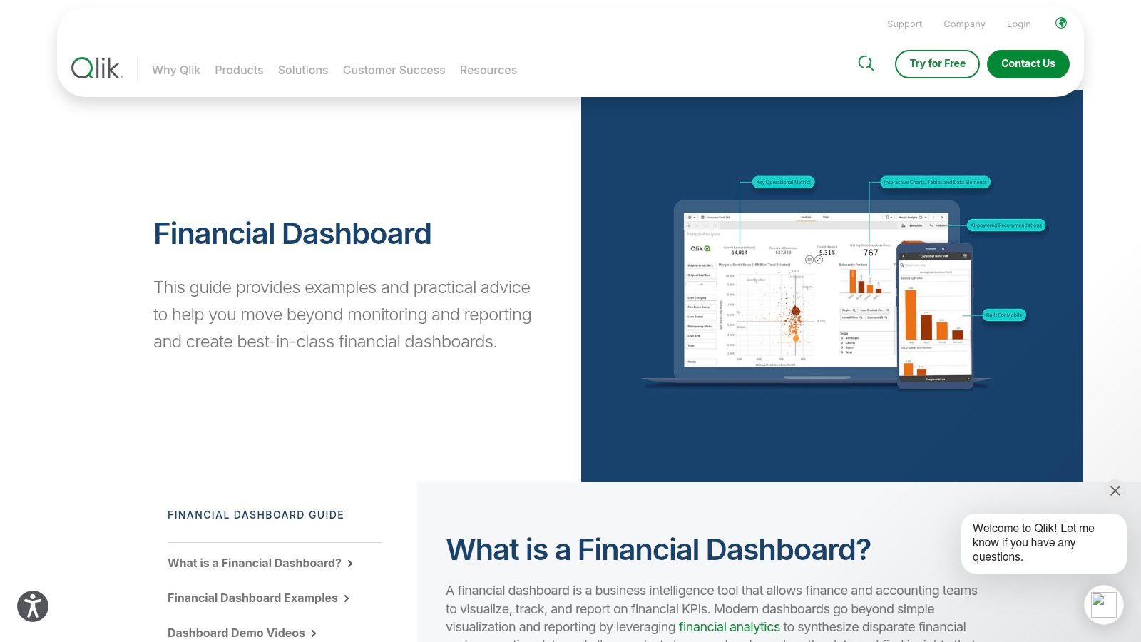
Qlik's financial dashboard examples emphasize exploration. The examples cover areas such as cash flow, internal rate of return analysis, P&L, and liquidity, with a focus on slicing information across accounts, periods, and entities.
That associative approach suits finance teams that investigate causes rather than follow a fixed reporting path. A Controller reviewing an unexpected expense movement may want to move across entity, account, period, department, and vendor views without waiting for a new report. Qlik's model can support that type of ad hoc analysis when the data relationships have been designed carefully.
The value of associative exploration
Qlik is particularly compelling when variance analysis crosses organizational boundaries. Multi-entity groups, businesses with multiple revenue streams, and finance teams comparing liquidity positions can benefit from a model that encourages investigation rather than forcing users through a single hierarchy.
The strengths are practical:
- Ad hoc slicing: Users can explore relationships across finance dimensions.
- Governed publishing: Central teams can manage approved applications and access.
- Security controls: Row-level access can support controlled distribution.
- Reusable patterns: Finance examples can inform cost, revenue, and liquidity views.
Teams comparing Qlik implementations can also look at practical peer questions and sample builds in Qlik Community, the Qlik subreddit, and Stack Overflow questions tagged Qlik.
The cost is model complexity. Teams need people who understand Qlik's associative model, data preparation, and capacity planning. Capacity-based pricing also requires careful sizing, especially when more users, entities, or data sources are added. A dashboard that starts as an exploratory tool can become another system Finance must administer.
The more freedom a dashboard gives users, the more carefully Finance must govern definitions, security, and data ownership.
Qlik can complement an ERP, but it shouldn't be expected to establish the accounting source of truth. Before selecting it, clarify whether the general ledger, subledgers, consolidations, and dimensions will live in Sage Intacct or another system, and how Qlik will inherit closed-period and security rules. Lucentive's guidance on gaining confidence through data quality assurance addresses the prerequisite that makes exploratory analytics useful instead of merely fast.
5. Databox Financial Dashboard Templates
Databox's financial dashboard templates are built for speed. The platform connects with sources such as QuickBooks, Stripe, Xero, Google Sheets, and other business applications, giving smaller finance teams a practical way to assemble a shareable financial view without a heavy BI deployment.
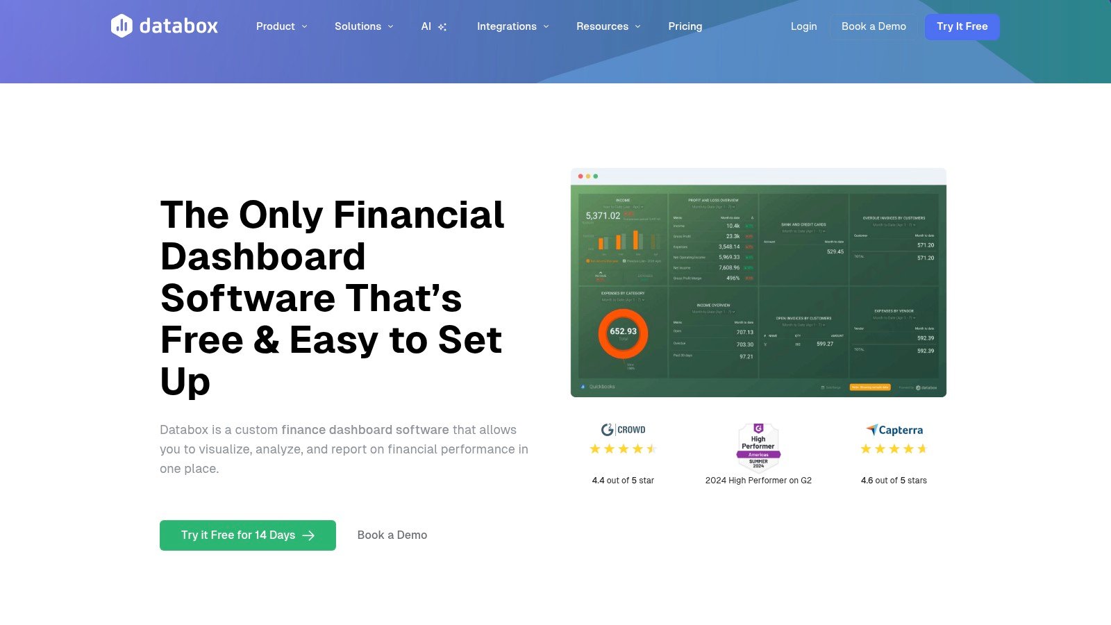
This is often the right starting point for a company that has outgrown spreadsheet summaries but isn't ready for enterprise analytics. A board snapshot, cash overview, revenue view, or budget comparison can be easier to publish when the team needs something usable quickly. Cloud delivery, sharing, and mobile access also suit distributed teams that want recurring visibility without building a large reporting function.
Where templates help
The value is low setup friction. A finance manager can begin with a prebuilt layout, connect available sources, and refine the view around the measures leadership reviews. That can expose whether the organization has agreed definitions for revenue, cash, expenses, and performance before it invests in a more complex platform.
Databox fits best when:
- The reporting scope is limited: Leaders need a focused snapshot rather than a full finance model.
- Source systems are simple: The team isn't consolidating complex entities, funds, or operational dimensions.
- Speed matters: Finance needs a practical view while evaluating a broader systems change.
- The audience is small: Sharing requirements don't demand intricate security by entity or cost center.
The limitation is structural. Templates are less flexible than full BI platforms for complex modeling, semantic consistency, and advanced governance. Direct connectors can move data into a dashboard, but they don't necessarily resolve duplicated accounts, inconsistent classifications, incomplete dimensions, or a close process that depends on manual reconciliation. Finance teams that want more practitioner input can compare use cases and dashboard discussions in communities such as Reddit r/FPandA, Reddit r/BusinessIntelligence, Reddit r/Accounting, and CFO Dive.
For a nonprofit, the reporting question may involve funds, programs, grants, and restrictions rather than a simple company-wide P&L. That makes Lucentive's chart of accounts guidance for nonprofits a useful reminder that dashboard quality begins with accounting structure. Databox can make a clean source more visible. It can't turn an unsuitable source into a reliable fund-accounting model.
6. Geckoboard Finance and CFO Dashboard Examples
Geckoboard's finance and CFO dashboard examples take a different approach. These dashboards prioritize legibility, recurring leadership conversations, and live KPI visibility. They work well on wallboards, shared links, and executive screens where the reader needs to understand the status quickly without navigating a detailed report.
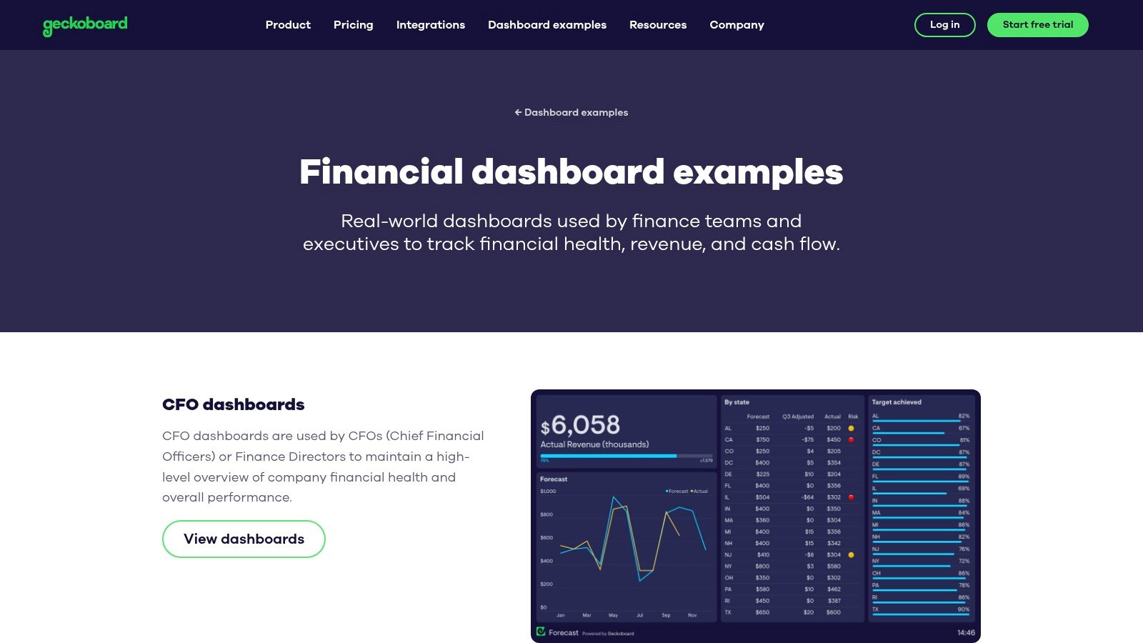
That design is useful for a daily leadership huddle or a distributed operating team. Revenue, cash, runway, and other selected indicators can stay visible while the group discusses action. The strength isn't deep financial analysis. It's disciplined communication.
A good wallboard has a narrow job
Geckoboard is attractive when executives repeatedly ask the same small set of questions:
- Are key results on track: Show the few measures that drive the recurring conversation.
- Is cash becoming a concern: Keep liquidity-related indicators visible.
- Where should the meeting focus: Highlight exceptions instead of displaying every available metric.
- Can non-analysts read it quickly: Use clear visuals and restrained design.
The trade-off is that wallboards aren't intended for granular investigation or complex modeling. A CFO may see a cash movement, but the dashboard may not provide the entity, account, vendor, or transaction path needed to explain it. Security by cost center or entity can also be less suitable than in a full ERP-native reporting environment.
This makes Geckoboard a useful communication layer, not a replacement for close reporting. The organization still needs a dependable system where transactions are recorded, dimensions are controlled, periods are closed, and management reports reconcile to the books.
A wallboard can tell the leadership team where to look. It shouldn't be the only place they can look.
For a mid-market company migrating from QuickBooks, Geckoboard may provide an immediate executive view during a transition. But if the business has healthcare locations, nonprofit programs, multiple entities, or project accounting requirements, the team should assess whether the dashboard can support the required reporting depth. In those cases, an ERP-native structure can reduce the distance between an executive signal and the accounting evidence behind it.
7. Domo Finance Dashboard Examples
Domo's embedded analytics and web portal documentation points to a broader enterprise use case. Its finance examples can support embedded analytics, external sharing, governed self-service, and automated data preparation across ERP and general ledger sources.
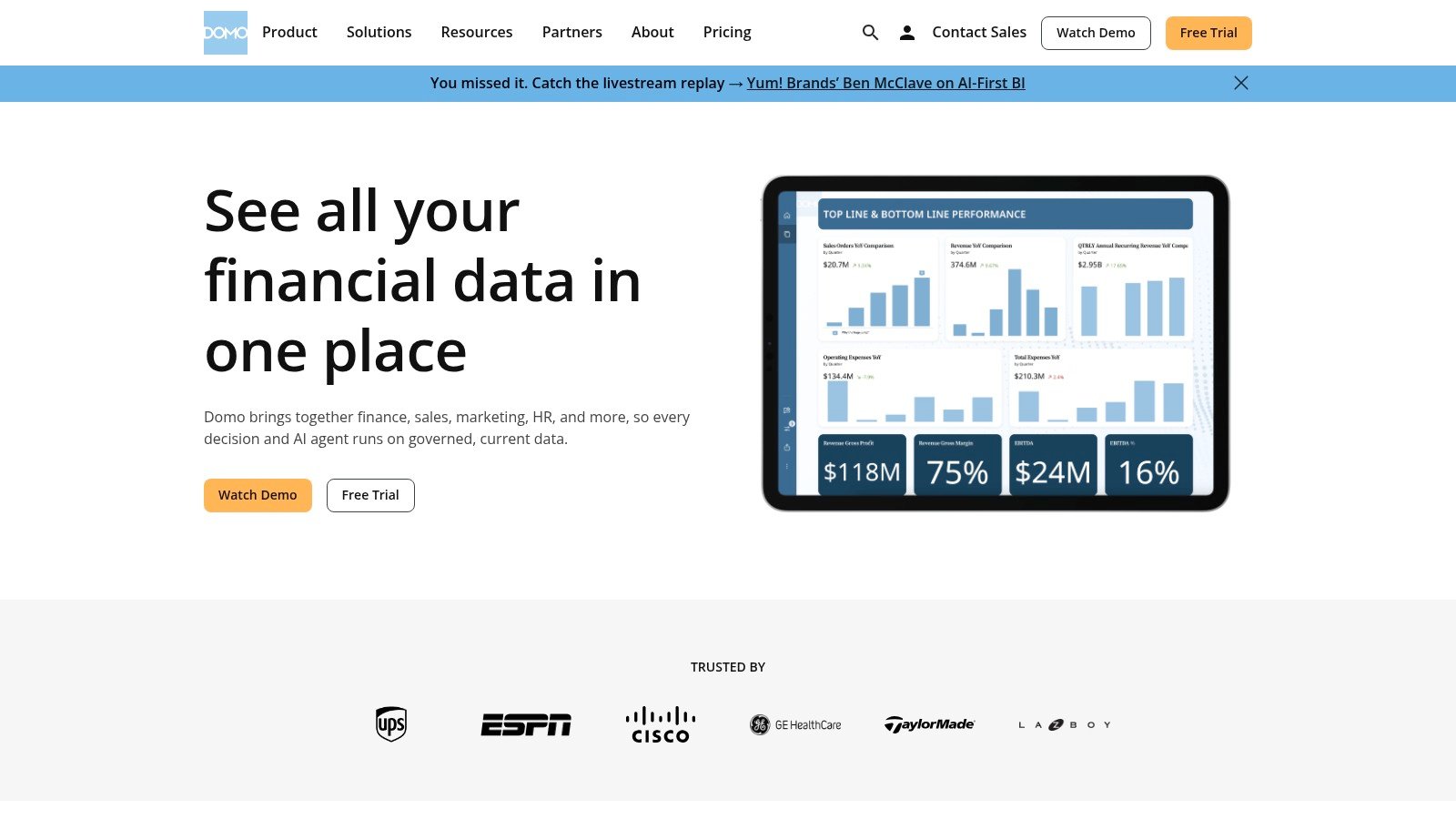
Domo is worth considering when finance reporting must reach users outside the core accounting team or appear inside another operational experience. Executive Stories mode can support leadership readouts, while native connectors and no-code ETL can help teams prepare and standardize KPI data across systems. The platform's appeal increases when the organization needs consolidation across departments or wants to embed analytics into a portal.
The enterprise trade-off
Domo's strengths are most visible in environments where reporting is not confined to the Finance department. A healthcare organization may want financial views within an operational portal. A multi-division business may need governed self-service across departments. A professional services organization may want project and financial information presented together.
The important considerations include:
- Embedded delivery: Finance insights can be placed into external or operational experiences.
- Data preparation: No-code ETL can help standardize inputs before dashboards consume them.
- Executive presentation: Stories can organize financial results for recurring readouts.
- Cross-functional consolidation: A shared platform can support broader analysis beyond the GL.
The disadvantages are equally practical. Pricing is enterprise-oriented and typically requires a sales engagement. Public examples are spread across documentation, partner pages, and industry material rather than presented in one centralized gallery. That makes it harder to judge the full implementation path from public examples alone.
Domo also sits above the accounting system. It can organize and present data, but Finance still needs reliable entity, account, period, and transaction foundations. If the source systems disagree, automated ETL can standardize the mechanics without resolving the accounting policy.
The right question is whether Domo solves a genuine distribution or consolidation requirement, or whether it adds another reporting layer to a business that first needs a stronger cloud ERP. For many growing organizations, Sage Intacct with role-based dashboards may reduce that architectural distance.
Top 7 Financial Dashboard Comparison
| Solution | Implementation complexity | Resource requirements | Expected outcomes | Ideal use cases | Key advantages |
|---|---|---|---|---|---|
| Sage Intacct Dashboards and Reporting: What Finance Teams Actually Build First | Medium–High, consultative implementation and customization on Sage Intacct | Sage Intacct license + implementation partner (CPAs, developers, trainers); time and configuration | Role-based, implementation-ready dashboards; consistent KPIs and faster, cleaner reporting | Organizations already on Sage Intacct (healthcare, nonprofit, general business) needing finance-first dashboards | Tailored, partner-delivered expertise; finance process and platform knowledge |
| Tableau – CFO Dashboards Gallery | Medium, requires design discipline and external modeling for complex analytics | Tableau Server/Cloud, BI designers, governed deployment and sharing | Board-ready interactive visuals and drill‑downs for executive storytelling | FP&A and executive teams needing polished, governed dashboards | Mature governance, large community, strong executive visualization |
| Microsoft Power BI – Data Stories Gallery (Finance) | Low–Medium, community samples are easy to adopt but vary in polish | Power BI licensing (Pro/Premium), Microsoft 365/Fabric integration, minimal dev effort to replicate samples | Replicable finance reports with KPI cards, waterfalls and drill‑through | Teams standardized on Microsoft 365 seeking quick, integrated examples | Low TCO in Microsoft environments; abundant community content and strong security |
| Qlik – Financial Dashboard Examples | Medium–High, associative model requires learning and careful data modeling | Qlik platform, capacity sizing, skilled modelers for associative apps | Fast ad‑hoc associative exploration and multi‑entity variance analysis | Finance teams needing powerful slicing across accounts, periods and entities | Associative exploration for rapid insight; mature row‑level security |
| Databox – Financial Dashboard Templates | Low, plug‑and‑play templates with quick connector setup | Databox subscription, connectors to QuickBooks/Stripe/Xero/Sheets; minimal BI skill | Fast time‑to‑value dashboards and board snapshots | SMBs, small finance teams and agencies migrating from spreadsheets | Fastest setup; simple connectors and mobile/cloud sharing |
| Geckoboard – Finance & CFO Dashboard Examples | Low, quick setup focused on TV/board displays | Geckoboard account, simple data connectors (spreadsheets, SaaS, SQL) | Live, legible KPI wallboards for leadership and distributed teams | Executive huddles, status boards and teams needing clear at‑a‑glance KPIs | Very quick to stand up; emphasis on clarity and readability |
| Domo – Finance Dashboard Examples | Medium–High, enterprise deployment and embedding considerations | Domo platform, no‑code ETL, native ERP/GL connectors, sales engagement for pricing | Embedded, governed finance analytics with standardized KPIs and ETL | Enterprises needing embedded analytics, cross‑department consolidation and native ERP connectors | Built‑in ETL and embedding capabilities; strong ERP/GL integration |
Turn Dashboard Inspiration Into Finance Control
These financial dashboard examples point to four distinct buying decisions. Sage Intacct's ERP-native, role-based reporting is the stronger fit when Finance needs trusted financial control, consistent dimensions, multi-entity visibility, and drill-down to source transactions. Tableau, Power BI, Qlik, and Domo are better suited to broader governed analysis, cross-functional modeling, exploration, or embedded delivery when the organization already has a dependable accounting foundation. Databox works for lightweight visibility and rapid template deployment. Geckoboard works for recurring executive conversations where the priority is a clear, limited KPI view.
The wrong choice is usually not caused by a weak chart. It comes from asking one dashboard to serve every audience and every decision. A CFO needs a concise view of performance and risk. A Controller needs reconciled detail and close control. A department leader needs operational dimensions. An auditor needs traceability. Those requirements can share a data foundation without sharing one canvas.
A finance-led selection checklist
Before buying a standalone BI tool or committing to a cloud ERP, clarify:
- KPI definitions: What exactly do revenue, margin, cash, EBITDA, operating expense, and variance mean in your organization?
- Dimensions: Can users analyze by entity, department, location, program, grant, project, service line, or other operating attributes?
- Entity structure: How will the system handle separate entities, consolidations, intercompany activity, and management views?
- Drill-down paths: Can a user move from a headline KPI to the report and transaction detail behind it?
- Security: Which roles can view each entity, fund, location, department, or cost center?
- Data ownership: Who owns the chart of accounts, mappings, definitions, refreshes, and corrections?
- Close workflow: How will dashboards reflect reconciled and closed periods rather than incomplete activity?
- Implementation effort: What must be configured, migrated, integrated, tested, trained, and maintained?
- Time-to-value: What should leadership see first, and what can wait until the core model is stable?
The benchmark should be operational usefulness, not visual novelty. A financial reporting dashboard guide recommends hard thresholds such as revenue at budget plus or minus 5% daily, gross margin within plus or minus 2 percentage points of an industry benchmark weekly, a current ratio in the 1.5 to 3.0 range monthly, early-payment discount capture above 80%, and invoice processing time under 3 days. These targets illustrate how dashboards become control systems when owners, cadence, and actions are defined, not just descriptive reports. (financial reporting dashboard benchmark guide)
Modern dashboards also bring profitability and liquidity into the same leadership conversation. Common examples include operating cash flow, cash runway, EBITDA margin, and headcount versus plan, while CFO-oriented views may include current ratio, quick ratio, accounts receivable turnover, days sales outstanding, debt-to-equity, and cash conversion cycle. (financial dashboard KPI guidance) (CFO dashboard metrics)
A Power BI financial performance dashboard case study illustrates the value of connecting operating outcomes with unit economics and retention. It reported 226 active customers out of 243 total customers, LTV/CAC of 16.62, ARR/CAC of 526.54, and churn declining from 8.0% to 5.5% over time, showing how one dashboard can place growth efficiency and customer health in the same view. (Power BI financial performance dashboard case study)
The implementation gap is the deciding factor. Software alone won't define your dimensions, reconcile your reporting logic, or train leaders to use the result. Lucentive's experience as a Sage Intacct Value Added Reseller and Premier Implementation Partner, with more than 100 client implementations and a team that includes CPAs, developers, trainers, and engineers, is relevant when the company needs a customized path across healthcare, nonprofit, dental, professional services, or general business operations.
Summary
The best dashboard depends on the finance problem. Use ERP-native reporting for trusted control and accounting detail, governed BI for broader analysis, templates for lightweight visibility, and wallboards for focused leadership conversations. Before you select a tool, validate definitions, dimensions, security, drill-downs, close workflow, data ownership, and implementation effort. If the underlying books can't support the dashboard, a more attractive screen won't solve the reporting problem.
FAQ
What are the best financial dashboard examples for finance leaders?
The strongest examples match the dashboard to the decision. Sage Intacct role-based dashboards suit financial control and transaction-level reporting. Tableau, Power BI, Qlik, and Domo suit broader analysis, exploration, governance, or embedded delivery. Databox supports lightweight template reporting, while Geckoboard focuses on clear recurring KPI communication.
Which KPIs should a CFO financial dashboard include?
A CFO view commonly combines profitability and cash-flow signals, including operating cash flow, cash runway, EBITDA margin, and headcount versus plan. Working-capital and efficiency measures can include current ratio, quick ratio, accounts receivable turnover, days sales outstanding, debt-to-equity, and cash conversion cycle. The final KPI set should reflect the company's business model and agreed definitions.
Is an ERP-native dashboard better than a standalone BI dashboard?
It depends on the need. An ERP-native dashboard can keep financial definitions, dimensions, security, and transaction drill-down close to the accounting source. A standalone BI tool can be valuable for broader cross-functional analysis, governed visualization, exploration, or embedded reporting, especially when the underlying data model is already reliable.
What are the limitations of QuickBooks for financial dashboards?
QuickBooks can be a useful source for lightweight dashboard templates, but growing organizations may need more structured multi-entity control, dimensions, consolidated reporting, auditability, and role-based drill-down than a basic accounting setup provides. Adding a visualization layer doesn't automatically solve those underlying requirements.
Why does a finance team need an implementation partner?
An implementation partner helps translate business processes into chart-of-accounts design, dimensions, security, report groups, dashboard roles, workflows, integrations, testing, and training. That work determines whether the dashboard remains trusted and useful after launch. Lucentive brings Sage Intacct implementation experience across healthcare, nonprofit, and mid-market organizations.
Lucentive helps finance leaders design and implement Sage Intacct dashboards that connect executive KPIs to reliable accounting detail, with custom reporting for healthcare, nonprofit, and mid-market operations. Schedule a 30-minute working session or custom Sage Intacct demo through Lucentive to see whether the platform and implementation approach fit your company before you buy Intacct alone or add another reporting layer.